

Completed Alt-J ‘Tessellate’ Digipak

‘Tessellate’ Final Edit
How did you use media technologies in the construction, research, planning and evaluation stages?


What have you learned from audience feedback?
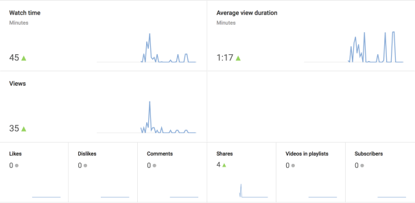
I opened my Final Music Video in Youtube, accessing its information regarding audience interest, location and access to my video. Looking at the information below I can tell that the secondary chase sequence has provoked interest in my video audience. This can be seen more clearly on the right, the peaks in the digram show the chase sequences but as lip syncs are introduced interest is lost, diverting from the action and tension. I feel this is useful when thinking about the effectiveness of narrative within my entire music package. The use of environment and interaction between characters proves successful in captivating an audience rather than the reenactment of a band or artists performance of music.
 When looking at audience gender it’s interesting to discover that 82% of the video audience is male. This response opposes my intention to gain a diverse audience through the inversion of gender stereotypes and a strong female lead, hoping would appeal to a roughly balanced audience.

Also I have made a video of Audience Feedback on my Music Video final edit, I have not intentionally used all male interviewees, only done through time limitations and availability.
How effective is the combination of main product and ancillary texts?


In what ways does your media product use, develop or challenge forms and conventions of real media products?
I have produced a 3×3 good of shots from my ‘Tessellate’ music video. I focus on having variation in colour, lighting, costume and editing (filters).

Below is another 3×3 grid of shots made from separate media examples, all the1 shots I have chosen are similar to the ones above.

Coldplay – ‘Midnight’

Alt-J – ‘Hunger of the Pine’

Lorde – ‘Team’

Panic at the Disco – ‘Emperor’s New Clothes’

Imagine Dragons – ‘I bet my Life’

George Ezra – ‘Barcalona’

Ed Sheeran – ‘Give me Love’

Lapsley – ‘Hurt Me’

Alt-J – ‘Hunger of the Pine’
1.


Coldplay – ‘Midnight’
The first shot develops genre conventions through its use of filters, I have used the X-Ray filter from the iMovie application. Filters allow the creation of an etherial, unworldly environment, this effect really adds to the shadowed psychedelic feel and theme of Coldplay’s video. For my own video, I have used the effect to provide a metallic shine to pebbles and liquid, aiming to enhance the development of narrative within my video, the filter allows the idea of the forest being split between two parallel worlds more clearly to an audience. Additionally I have reversed the shot so that the flow of water is backward, in Coldplay’s video there are many layered and slow motion shots, presenting the idea that within the forest environment there is a slow to the passage of time, this was very effective so I decided to adapt the effect within my own video.
2.


Alt-J – ‘Hunger of the Pine’
This shot shows the similarity in action between the main characters of both videos, I have conformed to the genre traits as both videos are by the indie-rock band Alt-J. Both characters wear dark brown and grey. The actions made by the character within ‘Hunger of the Pine’ made the character seem very involved and part of the environment, this is why I have chosen to have one of my starting shots with the teenage boy grabbing the trees for support whilst running past. I have also conformed to the genre traits by filing my own video in a non urban environment, the same as the shot on the right.
3.


Lorde – ‘Team’
Here I haven’t challenged but diverted from the use of extreme lighting effects within my video. Lorde’s ‘Team’ features heavily low lighting to help convey a deep tropical forest environment, however this was made through expensive lighting equipment and filters. I instead decided to film in front of a background of undergrowth and dark tree roots decided not to use lighting equipment on the actor, but left the filtered light at midday through the trees to provide a clear visible image of my character in which their lip-syncing was easily visible, the opposite effect to Lorde, however with the same setting and partially conforming to Indie genre conventions within her video.
4.

Panic at the Disco – ‘Emperor’s New Clothes’

Like above I have used simplistic lighting methods, complying with my own indie genre conventions of using simple DIY craft like methods to crate effective results. Smoke machines and spotlights have been used to create an eerie silhouette, I used the forest environment to advantage, finding an opening towards the direction of sunlight, allowing various effective silhouettes to be created. Instead of darkening the edges of the shot, I chose this shot type to allow the horizon one to cut through the skull allowing its outline to be clear like in Panic at the Disco’s video. Also with costume, we have not used expensive SFX and makeup due to time and budget limitations, my video uses a wooden and plastic rams skull figure tied as a headpiece with string and faux leather straps, there is synergy with this choice medium throughout my video to make it obvious the link between all props used.
5.

Imagine Dragons – ‘I bet my Life’

This shot shows resemblance to the first, however the filtered shot focuses on the shadows and curves of objects. Notably the leaf on the top right corner has a white glow around its edges. I already follow the indie genre convention of the band Imagine Dragons through the use of filters. The same colour scheme has been used also connecting both shots. These shots differ although they both focus on bodies of water, my video looks at a puddle from above with the trees reflected blurred. The Imagine Dragons video looks at a floating man from below at he drifts along river, there is a white glow form behind him, like the leaf with a white glow underneath. Both videos feature non-urban environments complying again with genre conventions.
6.


George Ezra – ‘Barcalona’
The setting of these two shots are similar in that they are both forests, Ezra’s video is filmed in a botanical dome, my own video in an inclined forest in winter. My video has met two indie genre conventions, the use of non urban environments and the use of a earthy/grey and green colour palette for my video, this is the similarity between both videos. Both shots capture the delicate aspects of nature, the twig is captured before it is broken, resting on a background of fallen leaves. Ezra’s shots presents various tropical plants suspended, balancing and still as he hides within the leaves singing to the camera.
7.


Ed Sheeran – ‘Give me Love’
I have broken genre conventions and opposed the representation of props in comparison to Ed Sheehan’s video, I decided to use coloured props within my video at various intervals to not only break up the continual forest environment but to emphasise the DIY craft trait of my video genre. There is a synergy between all props used in my video being the use of leather, twigs and string. In Ed’s video there is a continual dark lighting broken up by occasional white neon lights, the woman’s wing props have been made on a high budget, with no suggestion of that she is an angel, there is heavy use of realism there. My video uses its lack of budget to provide creative suggestion using resources found in forests to blend in with the setting for my video.
8.


Lapsley – ‘Hurt Me’
Both video shots have been blurred to provide unfamiliarity for the audience. My intentions were to have my audience question what the teenage boy had transformed into before his reveal, Lapsely’s video shows a distressed and distress image of herself become clear and rearranged over the profession of the video. Until the mid point of her video it is unclear what the image is of, she is dehumanised. I thought there was a necessary comparison here because of my choice to label the video as a piece of art as Lapsley’s image and theme involves the distortion and repetition of Photography, there is clear use of indie genre conventions here through the use of art and experimentation within media pieces.
9.


Alt-J – ‘Hunger of the Pine’
Returning to my main influence for the ‘Tessellate’ video I have produced, ‘Hunger of the Pine’ ends similarly to my own video, the main character stands in an open field, having accepted his fate he pours gasoline over himself as arrows of fire shower him from the sky. Within my video the main character is deceived into false hope, represented through his adorned wings as he jumps off a steep cliff at a clearing in the forest, shortly after the female antagonist who has been chasing throughout the video appears glancing over the cliff. Both these videos end with enigmas, we never see the characters perish but instead they are hinted at by a cut to black or disappearance within a dangerous environment. Both leave the audience intrigued at what might of happened next.
‘Real’ Release advert

This was the image I chose from the music video. I think it looks very appealing in conveying a mysterious and disrupted environment to an audience. The textures on the rocks are maintained in this filter really well and the reflection is blurred which will provide an interesting and unique effect when shown through an erased shape.

This is my initial attempt at trying out the plant erasers on this poster. From I this I discovered that thin, delicate shapes do not show the image underneath very well. They look nice but don’t do what is required on my checklist made after audience feedback.
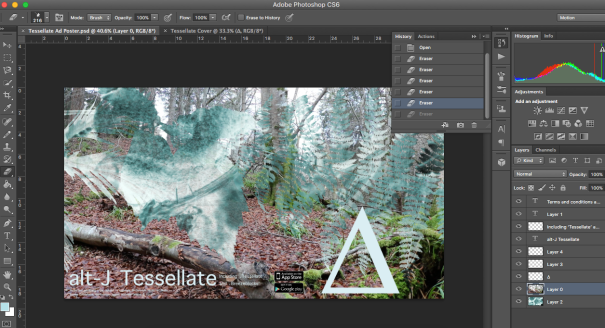
I then tried larger images with adjusted opacity so that branches and twigs could be seen through. At this point I thought about Coldplay’s ‘Midnight’ music video and the frosted glass effect over certain shots. I wanted the poster to be a window into the peculiar world in my own video and I believe that using large erasers spaced out form each other will achieve this.

I cleared all the previous erasers to pursue the idea above. I really liked the dark turquoise grass in the bottom right growing out to light blue in the centre. the transparent leaves to the left allow the background image to be seen well. I thought it was important to have variation on this advert, the opacity grows form one side to the other; Some areas block out the background behind. I liked how the filter included my chosen colour of text working very well with the writing and imagery at the bottom, there is clear use of synergy to my Digipak and Music video here.
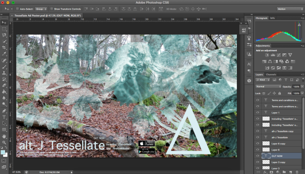
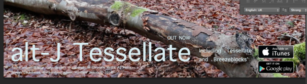
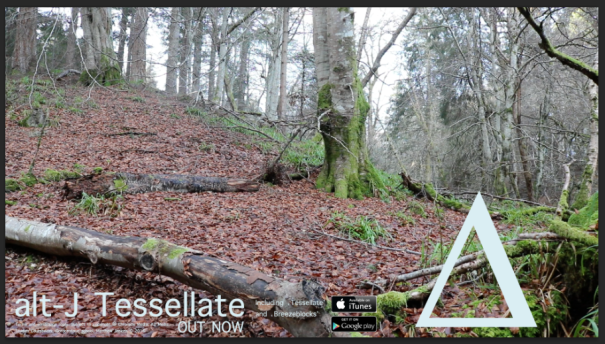
I accidentally deleted the ‘OUT NOW’ text so I included it, I enlarged the text so the album’s current release can be easily seen. Also the wrong image was placed above the google play icon, I changed it to the iTunes store instead of the app store. I am extremely pleased with the outcome, the advice was very helpful and the advert it consistent with the style of the music video and Digipak with clear synergy. The text is kept to the bottom of the poster, kept in line to appear tidy and precise. The eye follows to the ∆ symbol which protrudes into the landscape, drawing the viewers attention and providing a link between the two worlds and effects shown, not only in colour but within the delta triangle both images are contained.

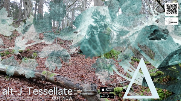
Lastly in response to my own observations alongside my audience feedback I have added both a QR code and Infectious Record Company logo, instead of following the line of text at the bottom of the advertisement, the eye follows upward from the ∆ to the top right corner, the following the x-ray filter branch across to the left. This choice subtly ensures that the Young-Alts and the wider audience of my media package will observe the whole poster,taking in all features and references to the music video as synergy. The colour values are weak and pale suiting the white outlines for both images. I personally felt that both images would stick out and look unappealing against the forest floor.

Below is my final poster design for the Alt-J ‘Tessellate’ album.
Audience feedback from Album release poster
I used the Social Networking platform Facebook again as feedback was quick and instantaneous due the large availability of people.

This was the most useful comment I received regarding the positives and needed improvements regarding the poster.
From this answer, the improvements I need to make are:
- Apply synergy with the inclusion of the layered effect.
- Apply filters from the music video like on the Digipak.
- Emphasise the depth of the poster landscape to draw an audience in and captivate them.
After contemplation my own suggestions are:
- Definitely use the X-ray filter from the ‘Tessellate Video’, shadows are enhanced with a glow around objects; this should cover both the layer and filter suggestions above.
- Reuse the plant and foliage eraser bushes on photoshop, creating a foreground and background, the erased areas showing the background photo suggests leaves and grass close to the viewer.
- There is a lack of interactiveness with my poster, I think it needs a QR code, drawing audiences near to use and find out more.
- The Record Company logo for Infectious is not included, this should be a feature as they are group that needs be represented within a media music package, due to their assistance in the production of an album.
Album advert mock-up
The plan above is based on this image taken on my initial visit to the filming location. I though it was striking and represented the music video very effectively.

This is the image I have chosen as the background for the album Poster. The greens stand out nicely against the dark oranges of the leaved floor.

The artist and title have been inserted as well as the ‘∆’ symbol. I wanted all of the forest features to be shown through the icons centre; the branches, the moss and leaves.

I have also included the highlighted singles off the Album to the right ad below are the terms and conditions relative to my media company Chronicle media, copyright is shown and the year of release (2016) present.

Also the indications of iTunes store and google play are placed at the bottom, not intruding not he landscape. The ∆ was moved to the right to be separate and isolated, jutting into the landscape unlike the other text, showing its significance as a band symbol and icon of recognition for their brand.
Since this poster is an indication of the albums release or date of release, it seemed necessary to input that the album is ‘OUT NOW’ above the album title.
This mock-up replicates the plan made previous. I am interested what the input of my teenage audience can bring to this advert. I am pleased with the layout so far, I am looking for additions now.
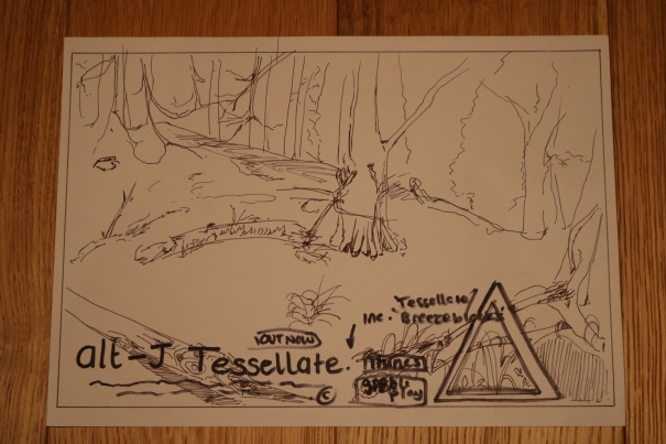
Album advert flat plan
Above is my plan for the ‘Tessellate’ album artwork, it involves a detailed landscape photograph of the same forest environment as my music to spark recognition form my target audience. An important feature of the poster is the Delta symbol in the bottom right, a reference image for the album and the band. I have included the band name and album title in the same light blue font as the album. This use of synergy is necessary in the advertisement scheme as it helps fans to familiarise themselves with he albums style and ‘look’. Other important features include the reference of the albums purchase online on iTunes and google play, two leading digital music sites. I am unsure what else to add, I want there to be consistency between the Digipak and this advert. I will look for audience feedback after producing a mock up of this plan.

